

This post was originally published on this site.
UN votes to adopt new world map to reflect Africa’s true size
-
Published
The UN General Assembly has voted to replace the traditional world map with one that more accurately reflects the size of Africa.
The “Correct the Map” resolution, sponsored by Togo and backed by African Union (AU) members, passed with the support of 164 nations, including France and the UK. The United States was the only nation to vote against it – and there were six abstentions.
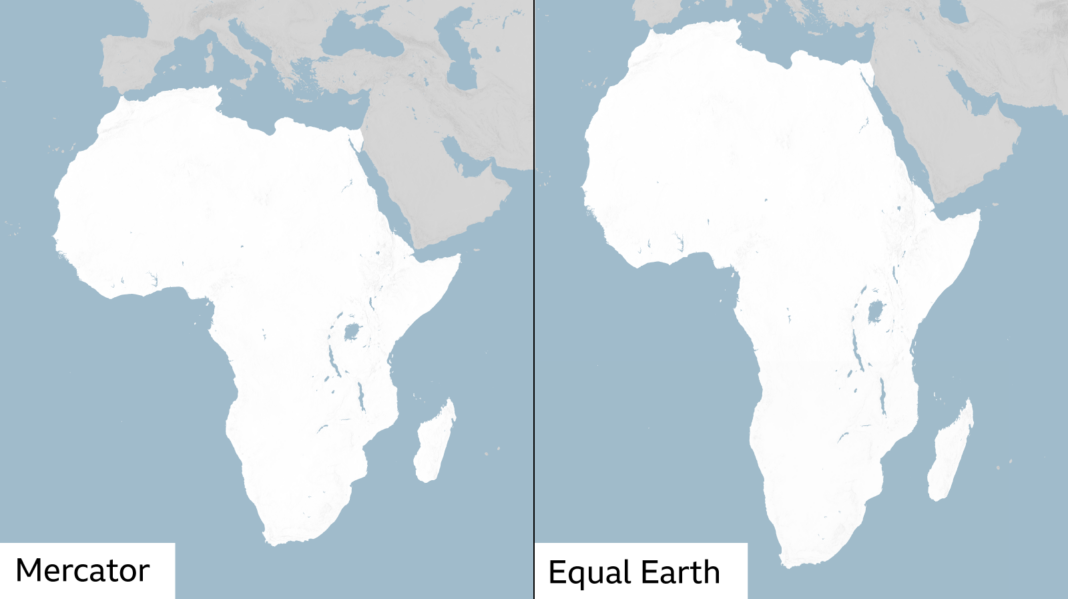
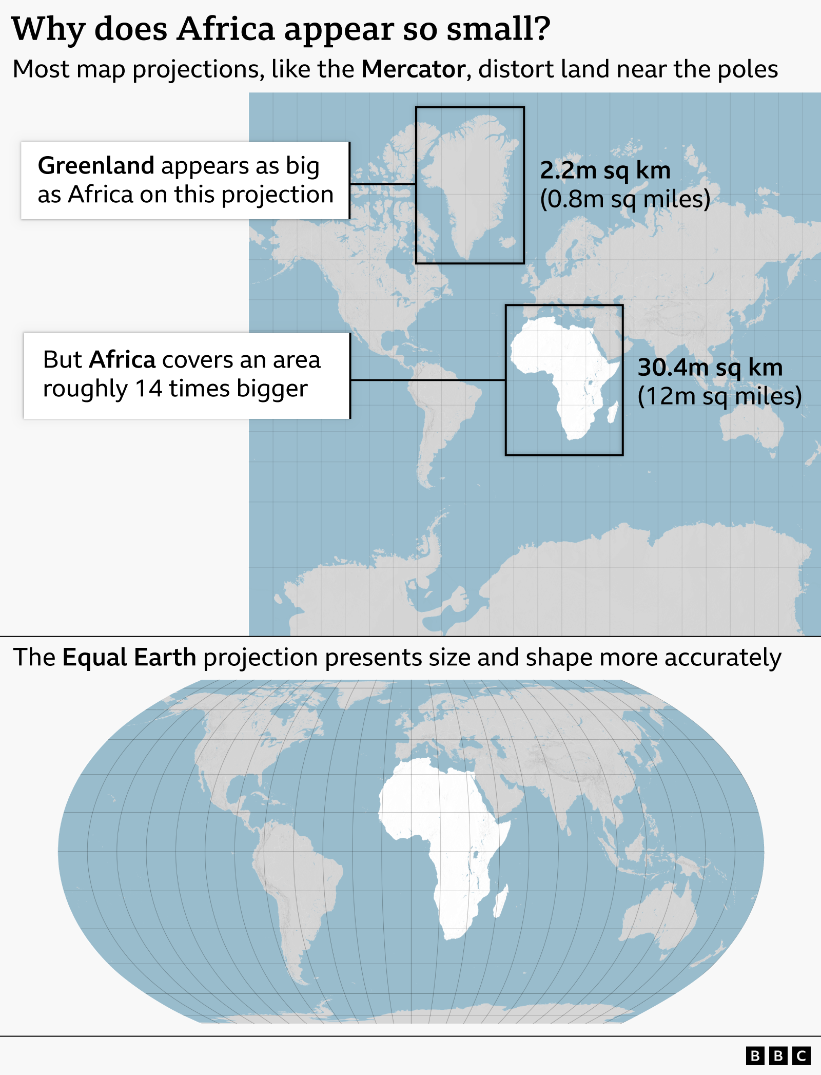
The Mercator map, which has been in common use since the 16th Century, has come in for criticism as it shows Africa as similar in size to Greenland, even though it is 14 times larger.
Critics say this leads to the development needs and potential for countries near the equator to be minimised.
The Mercator map was designed in 1569 by the Flemish cartographer Gerardus Mercator to help European explorers navigate across the world.
The distortion of his map is a result of the fact that it is impossible to accurately represent the surface of a globe on a two-dimensional chart.
Whenever a map of the world is drawn, compromises need to be made.
The Mercator map shows the curvature of the Earth by making countries near the equator seem smaller than they are, with countries nearer the poles appearing bigger.
In an effort to correct this, a team of cartographers in 2018 created an equal area map they called the Equal Earth projection.
In February, the AU’s 54 member states adopted it, saying it “more accurately represents the sizes of all continents, particularly Africa”.
Ahead of Friday’s vote, Togolese Foreign Minister Robert Dussey told the Reuters news agency: “A fair world begins with a fair map.”
Earlier he had told a UN briefing: “A map is never neutral. It shapes perceptions, influences how the place of peoples and continents in the world is understood.”
The UN vote is non-binding but will see changes to the maps used by institutions around the world.
More BBC news from Africa:
-
Did a goat herder’s lucky $200 nugget spark a gold rush in western Kenya?
-
Published23 August
-
-
What is Ebola and why is stopping the latest outbreak so difficult?
-
Published25 August
-

Go to BBCAfrica.com, external for more news from the African continent.
Follow us on Twitter @BBCAfrica, external, on Facebook at BBC Africa, external or on Instagram at bbcafrica, external