


Just how hot and dry was your summer? Use our postcode lookup to find out
-
Published
The UK faced its hottest summer on record this year, with much of the country experiencing drought and repeated heatwaves.
But temperatures and rainfall were not the same everywhere. Type in your postcode to see what summer 2026 was like in your area.
🏠🌤️ How was summer 2026 near you?
A modern browser with JavaScript and a stable internet connection is required to view this interactive.
As a result, we can’t show information for your location, but data for the entire UK is available below.
☀️ Temperature
In the UK summer temperatures have been above average.
The maximum daily temperature was 21.3C on average, which is 2.4C above what it was for summer between 1991 and 2020.
Virtually all of the UK experienced above average temperatures, driven by repeated heatwaves.
Southern England and Wales saw heat far above usual. Temperatures were closer to normal across Scotland and Northern Ireland.
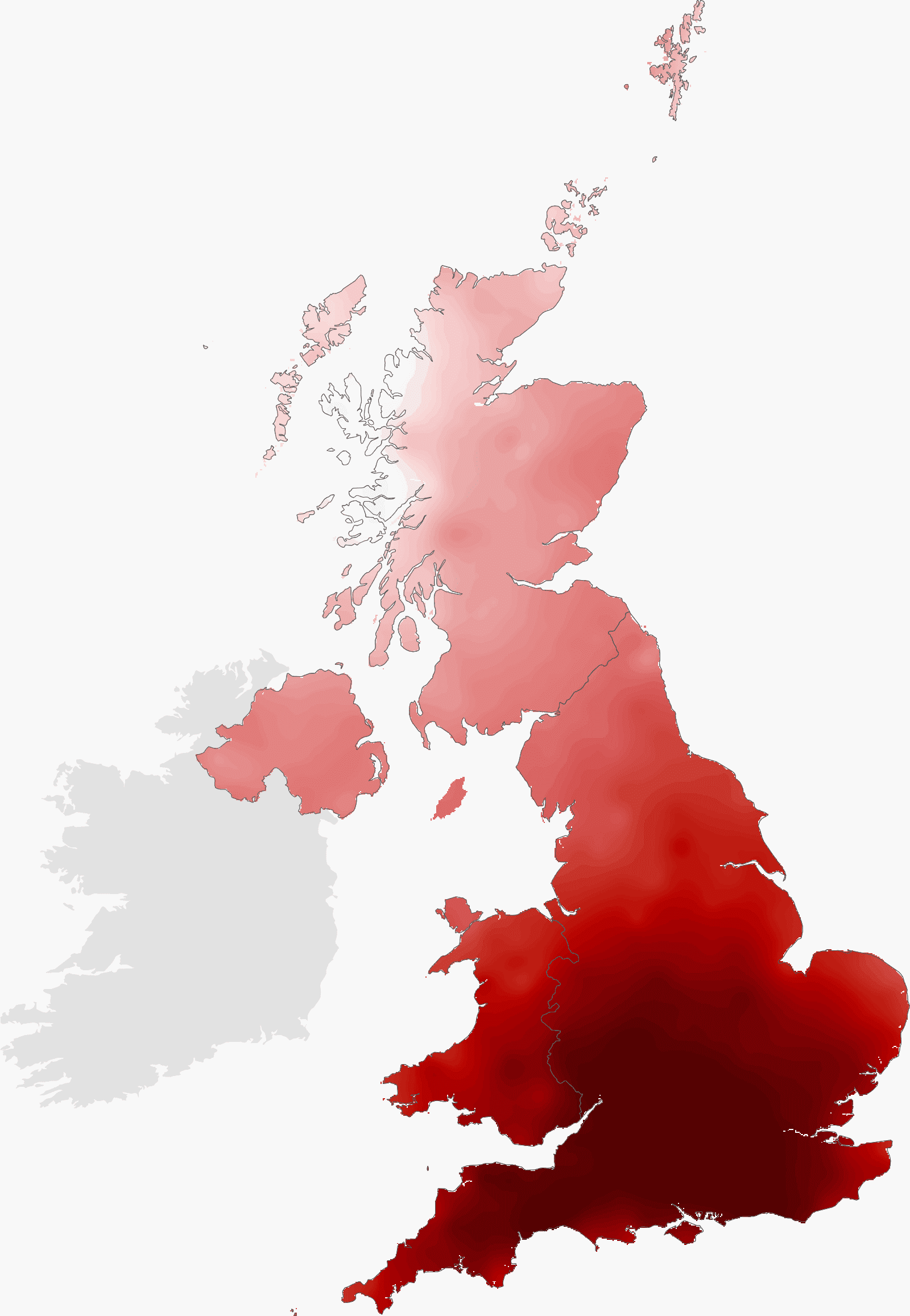
Average daily maximum temperature map key
Colder: blue
Warmer: red
-4C: deepest blue
No Change: white
+4C: deepest red
🌧️ Rainfall
Rainfall in the UK has been below average this summer.
Across the country a total of 195mm of rain fell on average, which is 23% below what it was for summer between 1991 and 2020.
Summer months tend to be drier, but this year was exceptional. Only north-western Scotland saw more summer rain than usual, as droughts were declared across much of the rest of the UK.
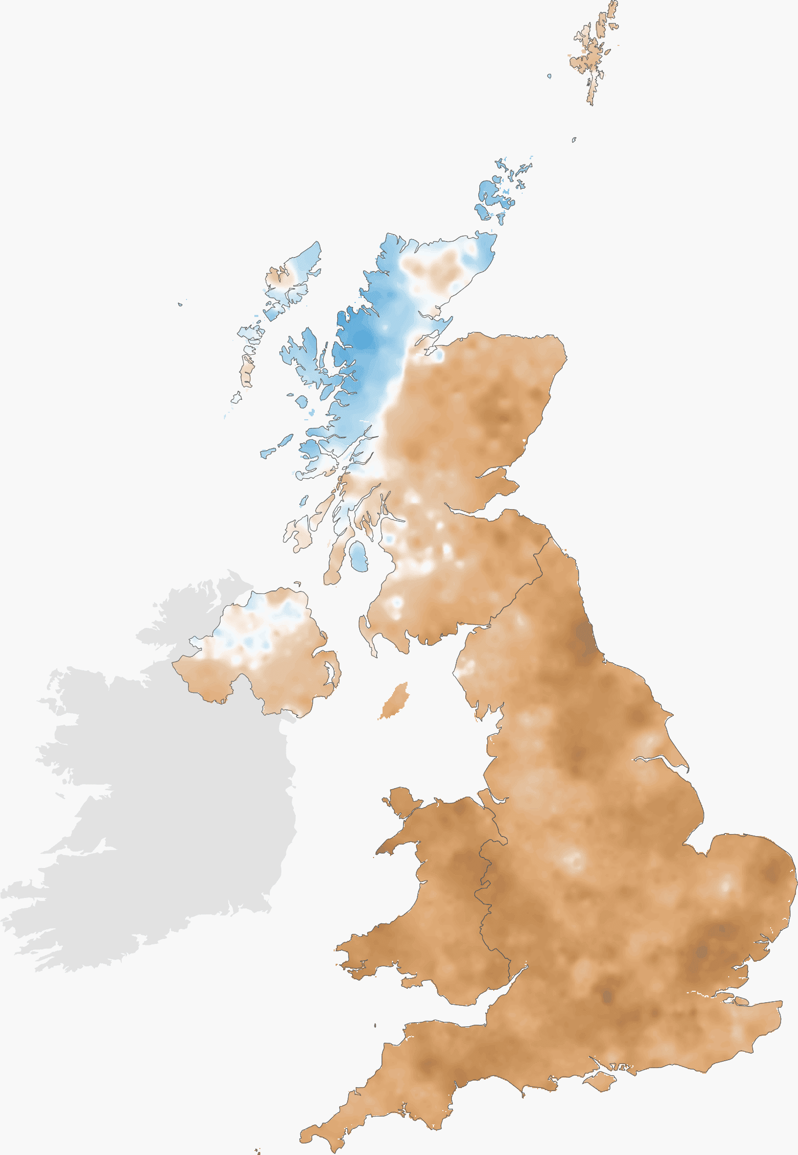
Total rainfall map key
Drier: brown
Wetter: blue
-100%: deepest brown
No Change: white
+100%: deepest blue
About the data
Where does the data come from?
This lookup uses data from the HadUK Grid dataset
(opens in new tab), which is produced by the Met Office Hadley Centre. HadUK Grid is one of the main products used by scientists to monitor and research the UK’s changing climate.
The HadUK dataset displays temperature and rainfall data across a uniform grid covering the entire landmass of the UK. The data does not cover the Channel Islands. Every value on the grid is an estimate for the centre point of a 1km by 1km grid box, the most detailed climate data publicly available for the UK. The values are created using observations from land-based weather stations across the country, and by taking into account additional factors such as altitude, terrain and distance from the coast to scientifically “fill in the gaps” between weather stations.
The results displayed for each grid area represents a mean average of that grid cell and its nearest grid cells. For most areas, this represents a 5km square centred on the primary grid cell. Along irregular coastlines and on small islands, the nearest grid cells are chosen to match the shape of the coastline or island, but no cells are further than 7km away.
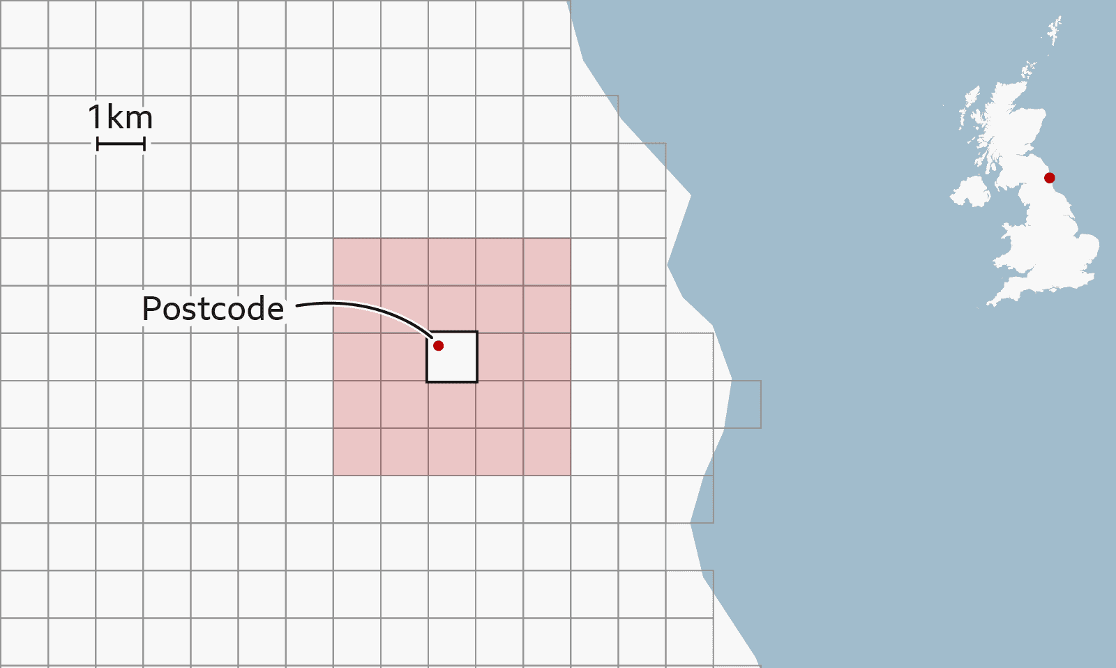
This approach aims to avoid sharp jumps between neighbouring locations which may occasionally arise due to uncertainties in the data, while still making use of the most detailed dataset available to capture local weather conditions across the UK’s varied geography.
The data for 2026 is provisional, with fewer observations feeding into calculations due to lags in data availability. As such, the precise values could change slightly in future as more data comes available. The historical averages are calculated over a 30-year period from 1991-2020, which matches the standard period used by the UN’s World Meteorological Organization.
What does the weather data represent?
The average temperature represents the mean average of the selection of grid cells across the month or season.
The maximum temperature is the mean average of the daily maximums recorded across all nearest grid cells for the month or season; the minimum temperature is the mean average of the daily minimums.
The rainfall is the total amount of rain for the month or season, averaged across the selection of grid cells.
Acknowledgements
Methodology support from Dan Hollis, Amy Doherty and Oli Claydon, UK Met Office.
🏠🌤️ How was summer 2026 near you?
Enter a full postcode below
☀️ Temperature
Show data
Average daily maximum temperature map key
Colder: blue
Warmer: red
-4C: deepest blue
No Change: white
+4C: deepest red
🌧️ Rainfall
Show data
Total rainfall map key
Drier: brown
Wetter: blue
-100%: deepest brown
No Change: white
+100%: deepest blue
About the data
Where does the data come from?
This lookup uses data from the HadUK Grid dataset
(opens in new tab), which is produced by the Met Office Hadley Centre. HadUK Grid is one of the main products used by scientists to monitor and research the UK’s changing climate.
The data for 2026 is provisional, with fewer observations feeding into calculations due to lags in data availability. As such, the precise values could change slightly in future as more data comes available. The historical averages are calculated over a 30-year period from 1991-2020, which matches the standard period used by the UN’s World Meteorological Organization.
The HadUK dataset displays temperature and rainfall data across a uniform grid covering the entire landmass of the UK. The data does not cover the Channel Islands. Every value on the grid is an estimate for the centre point of a 1km by 1km grid box, the most detailed climate data publicly available for the UK. The values are created using observations from land-based weather stations across the country, and by taking into account additional factors such as altitude, terrain and distance from the coast to scientifically “fill in the gaps” between weather stations.
What do we mean by your area?
We’ve matched every active postcode in the UK to its nearest 1km by 1km grid cell in the HadUK dataset.
The results displayed for your area represent a mean average of that grid cell and the surrounding grid cells to your location. For most areas, this represents a 5km square centred on your postcode. Along irregular coastlines and on small islands, the nearest grid cells are chosen to match the shape of the coastline or island, but no cells are further than 7km away.
This approach aims to avoid sharp jumps between neighbouring locations which may occasionally arise due to uncertainties in the data, while still making use of the most detailed dataset available to capture local weather conditions across the UK’s varied geography.
What does your area’s weather data represent?
The average temperature represents the mean average of the selection of grid cells across the month or season.
The maximum temperature is the mean average of the daily maximums recorded across all nearest grid cells for the month or season; the minimum temperature is the mean average of the daily minimums.
The rainfall is the total amount of rain for the month or season, averaged across the selection of grid cells.
To calculate the number of days above the heatwave threshold, we first averaged the daily maximum temperature for each grid cell with its nearest grid cells on every day. Using the Met Office’s heatwave thresholds
(opens in new tab), we determined how many maximum daily temperatures exceeded the threshold for your location, based on the centre of your grid cell. Your area’s heatwave threshold may be approximate if your postcode is near a county boundary.
This is not the same as the number of days spent in an official heatwave, where the threshold has to be met or exceeded for at least three consecutive days.
Acknowledgements
Methodology support from Dan Hollis, Amy Doherty and Oli Claydon, UK Met Office.
High-pressure weather systems sat over the UK for much of the summer, bringing clear, sunny skies for many parts of the country and creating warm, dry conditions.
But global warming – mainly the result of the burning of fossil fuels – is raising average temperatures in the UK.
This means that any warm spells can reach higher temperatures than the same weather systems of the past.
The Met Office estimates that this summer’s average temperature was made about 130 times more likely by human-caused climate change.
Rising temperatures also mean that our vegetation and soils dry out more quickly – which can worsen the effects of low rainfall.
UK summers are expected to become drier on average due to climate change – although when there is heavy rain it could fall in more intense bursts.
Not every summer will be as hot or dry as this one, as weather patterns vary from year to year.
But scientists warn that average temperatures will keep increasing while countries keep adding greenhouse gases to the atmosphere.
Development and testing by Ryan Smith, Stephen Connor and Adam Allen. Data support by Libby Rogers and Christine Jeavans.
-
Summer 2026 was UK’s hottest on record, Met Office says
-
Published1 September
-
-
How the UK’s extreme heat is shifting the conversation about air-con
-
Published30 July
-
-
A really simple guide to climate change
-
Published14 January
-

Sign up for our Future Earth newsletter to keep up with the latest climate and environment stories with the BBC’s Justin Rowlatt. Outside the UK? Sign up to our international newsletter here.